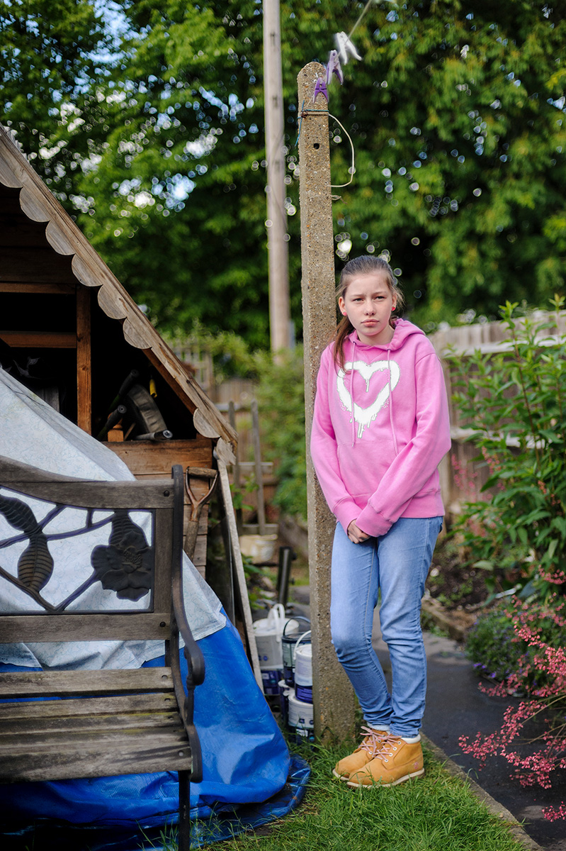
Posts tagged: art

And the battle begins

By admin, April 6, 2010 10:49 am

Well the starting gun has been fired and the contest begins. Many have a very negative view on whether anything positive will come from the general election, but photographers can take heart, thanks to the Houses of Parliament and Simon Roberts, there will be at least one good thing to come from it:

Watching a master II

By admin, February 18, 2010 3:52 pm

Over the years I have collected some informative documentaries exploring the work of great photographers. One of my favourites is called Frames from the Edge and concerns the work of the late, great Helmut Newton. Newton was a master of fashion photography with an erotic twist, and his work was always very clearly his. His life makes for interesting reading too, and I can recommend his autobiography published shortly before his death in 2004.

Anyway, someone has seen fit to publish the documentary on YouTube, so I am delighted to bring it to the attention of my readers. Enjoy.

PS   I know that Part 7 appears to be missing – I shall keep a look out for it.

We English continues to win accolades

By admin, February 12, 2010 1:30 pm

The World Press Photo awards 2009 have been announced, and Simon Roberts’ project has won third prize in the Daily Life: Stories category. Just one of the images is not from the book.

The recognition is well deserved, but somewhat curious as Roberts shoots less editorially now than he did 10 years ago. It is his first WPP win, although he was awarded a WPP Masterclass place back in 2003. Wonder what “Bollos” would make of it?

Watch this space

By admin, February 10, 2010 8:02 pm

The danger of entering photography as a profession in the 21st Century is that of being derivative. We are gradually drowning in an ocean of imagery swelling at an exponential rate as more and more people look to forge careers as photographers. The irony is that many established practioners openly question how much longer the traditional idea of photography might be commercially viable. In the meantime the wannabes churn out work that is little more than a pastiche of the work that inspired them to pick up a camera in the first place.

On the positive side, the more enured we become to seeing the same things endlessly repeated, the greater the satisfaction that arises from catching the glint of a gem in the sunlight. Today I have had one of those moments, and I am going to stick my neck out on the block.

Proof images from Carmel Walsch shoot.

Promotional images shot for Carmel Walsch, a Florence-based Irish shoe designer. © Leo Bieber 2010

While others his age were studying assiduously, a young British boy moved from his family home in Sussex to a flat in Florence in an effort to learn how to be a photographer by learing about life. To put it another way, he set out to become a photographer the old fashioned way. Driven by what is going on in his head and in front of his eyes, his creative sparkle has not been throttled by an over-emphasis on technique. While he is interested in many genres, he has determined that his own innate passions and creative bents should shoulder the burden of developing his eye.

Proof images from Carmel Walsch shoot.

Promotional images shot for Carmel Walsch, a Florence-based Irish shoe designer. © Leo Bieber 2010

I have been watching his work for a couple of years, and from what I have seen his sense of style is unique. Clearly I am not the only one to think so, as he has started to pick up some interesting and enjoyable commissions. Where others his age might be tempted to do the easy thing and make the money, he sees every job as an opportunity to push his creative envelope.

He still has a long way to go, but I think Leo Bieber is a name to watch.

We English – update

By admin, January 16, 2010 4:10 pm

Simon Robert’s latest work continues to attract fans around the world. To update his own posts on the glowing reviews that have marked We English out as one of the books of the year Photo Eye have just published their review of the best photo books of 2009, and We English makes it into the top 10 of three different reviewers: Martin Parr, Andrew Phelps, and Marco Delogu.

However, not all his reviews have been so glowing. “Bollos” on Amazon said it was rubbish, adding, “don’t bother, full of stunningly boring pictures. pretension (sic) title, very poorly executed. mine’s going to the charity shop.” To which a Mr Tim Morris responded: “Please tell me which charity shop your (sic) sending this brilliant piece of work to, I would love to have it, and any over (sic) items that you don’t understand.” All of “Bollos’” other reviews are on bits of IT equipment, so I’m not entirely sure what he was expecting to find in a large format book of photographs entitled We English, but I would not be at all surprised to find he supports a very national British political party, and never bothered to look through the book prior to purchase.

Still, Simon, if success is measured by being either loved or loathed, there appear to be no middlemen for you.

Watching a master

By admin, November 24, 2009 10:46 am

I have recently started a new project with some students in East London – I will post substantively on that at some point in the future – but suffice to say that for our second session yesterday, I thought we would have some practical fun by taking pictures of each other. None of that digital stuff. Proper photography – large format. I had a box of Polariod Type 55 which I took with the camera, a bucket, some sodium sulphite and some enthusiasm. They did really well.

Anyway, got me thinking about that master of large format black and white, and have just come across this series of old BBC documentaries on him from about 25 years ago. So, why read when you can watch.

Enjoy.

Quiet passing

By admin, November 13, 2009 1:41 pm
Name the ten most significant photographers ever. Go on. Actually, get a pen and paper and write them down… I’ll wait. In fact, post a comment below with your pick before you read any further.

It’s a safe bet that most of the names will be repeated endlessly, and those will be the ones tomorrow’s photographers aspire to match for their legacy if not their style. But there is one that seems to me at least, curiously absent from so many lists: Irving Penn.

Large Sleeve (Sunny Harnett), New York, 1951

Large Sleeve (Sunny Harnett), New York, 1951

Born in 1917 in Plainfield New Jersey, Irving Penn had an ordinary state education before embarking on a course under Alexey Brodovitch‘s tuition at the Philadelphia Museum School of Industrial Art.

Brodovitch, himself a photographer of the Bauhaus school, was to prove one of the most influential people in 20th Century photography primarily because of his art direction of Harper’s Bazaar from 1938 to 1958, but his student list from his time at the school is a veritable who’s who of late 20th Century photography. Diane Arbus, Garry Winogrand, Lisette Model, Richard Avedon, Eve Arnold to name a few. But whereas Avedon et al were intent on Brodovitch’s photography class, Penn was looking to pursue a career in what we might now think of as commercial art.

After graduating he took a couple of jobs in art direction on magazines, but dissatisfied he quit and used what little money he had to spend a year painting in Mexico. If he was hoping to find himself it worked, but not perhaps as he expected. Penn’s conclusion was that he would never amount to anything more than a very average painter, so he went back to New York and got a job as assistant art director to Alexander Liberman on Vogue magazine. It was to prove the most important decision of his professional life.

In essence Penn’s remit under Liberman was to suggest photographic covers for Vogue, but fortunately for Penn the staff photographers at Vogue were singularly unimpressed with his suggestions. Under less daring art direction, Penn might have found himself out on his ear, and the history of photography might have been very different indeed. But Liberman liked Penn’s ideas and convinced Irving to pick up a camera and shoot the concepts himself: Penn the photographer was born. It was Vogue’s first colour cover and Penn’s first professional photograph.

Vogue, October 1, 1943.

Vogue, October 1, 1943 - Vogue's first colour cover.

While he was known principally as a fashion and portrait photographer, he produced stunning work in still life, ethnographic, and nude photography. He was remarkable not just for the sophistication, beauty, and layered commentary inherent within his photographs, but also because the work itself was not derivative: it was unique, original imagery. If, like me, you have been enthralled by some of the post Vietnam work of Don McCullin, then explore Penn, because he did it first; while his nude studies reflected the abstractions of Bill Brandt working on the other side of the Atlantic.

His portraiture was powerful, captivating and revealing, employing an aesthetic that appeared to imprison the sitter, resulting in some of the most iconic portrayals of an entire generation of artists and thinkers like Capote and Miles Davis. Along with Avedon he swept a broom through the stuffy fashion photography that had gone before, preferring simple backgrounds to the fussy locations that to his mind distracted from the fashion itself. His work brought a whole new palate of nuanced thinking to fashion photography, and inspired – perhaps often unwittingly – a new generation of fashion photographers. It also brought him love.

There is a tendency for photographers (male ones at least) to fall for their models, and Penn did not buck that trend in marrying Lisa Fonssagrives, who appears as model in a great many of the photographs he took. Where he did veer from typical behaviour was in remaining married and devoted to her until her death at the age of 80 in 1992. Lisa was more than a muse to Penn. She is widely regarded as the first supermodel, earning nearly four times what her contemporaries were getting, with her own career lasting to the age of 40 – ten years longer than everyone else. Hers is the face on a myriad of iconic fashion images created by such luminaries as Hoynigen, Horst, Blumenfeld and others. But for all her protestations that she was just a “good clothes hanger”, there was a special magic that existed between them and it sparkled in the work Irving created. Alexander Liberman said on her death that they represented “an extraordinary relationship between a photographer and a model.” Adding that “she was the inspiration and subject of some of Penn’s greatest photographs.”

Truman Capote

Truman Capote, New York, 1965.

Penn excelled at his craft because he was interested in things. That sounds trite, but it cannot be overstated. The capacity to treat all things and all people as endlessly interesting is the bedrock of good engaged photography. And whether Penn was photographing frocks, or the indigenous peoples of the Andes, or disgarded cigarette butts, or products, he treated them all with the same level of reverence, curiosity and precision. The designer Issey Miyake exclaimed that Irving Penn “shows me what I do.”

His technical brilliance was reflected in his printing as well, and he is credited with a rebirth of interest in the practice of Platinum printing. The process is arduous and painstaking, but results in some of the most permanent prints possible, and Penn developed a method that produced the richest of detail and luminosity. Having found the best, he could never settle for anything less and spent the best part of three decades printing his exisiting and new work using the method. As a direct result, ask any museum to list their preferred type of black and white print, and the answer will come back “platinum or palladium”.

penn_sleep

Summer Sleep, New York, 1949.

The temptation at this point is to write Penn off as yesterday’s man. But the truth is that while his career may have started in 1943, he was still creating exceptional photographs for Condé Nast and others right up until his death last month on October 7 at the age of 92. A print of his photograph of a naked Kate Moss sold at auction for nearly a hundred thousand dollars, while another of his prints (Cuzco Children) broke the half million dollar mark last year.

Why, then, is his name not one that trips off people’s tongues when creating the pointless lists I mentioned at the start? It is simply because Penn never shouted about what he did. He led a touchingly domesticated life. A private man who avoided publicity not through affectation, but because it was not important to him. He was a quiet, kind perfectionist, and thanks to that perfectionism his work will be singing his prasies for many, many years to come. Whether you know it or not, if you are a photographer, Penn left his mark on you.

Irving Penn. Photographer. 1917 -2009.

We English – Simon Roberts

By admin, October 28, 2009 2:25 am

BOOK REVIEW: Simon Roberts – We English.

Being away from home for any length of time usually results in a longing for the familiar, but for Simon Roberts his marathon trip round Russia in 2005 (resulting in the critically acclaimed Motherland) raised questions rather than longings. As he explored what it means to be Russian and the relationships Russians have with their landscape, he found himself increasingly considering what his relationship was with his own country and nationality.

Roberts is about as middle English as it is possible to be. Brought up in the the Surrey commuter belt, the son of a Cumbrian woman and a London man, his childhood was one that would be recognisable to most middle class Middle Englanders growing up in the 70s and 80s. His recollections of childhood holidays in the Lake District and at the seaside informed much of his appreciation of the English landscape, inevitably leading to his questioning how much this shaped his own sense of nationality. Indeed, what does it mean to be English, as distinct from Welsh, Scottish, or the more general British?

Cover of We English by Simon Roberts

Cover of We English by Simon Roberts

Facing the sight of Russians at play in the Siberian landscape he began to examine the nature of the relationship we English have with our homeland, and before he had finished shooting Motherland his sights were set on the next project. Thus two years later, with Russia well behind him he persuaded wife Sarah and daughter Jemima to join him in a camper van on a ten month journey around England to observe the English in their environment, and possibly find out who he was in the process.

One of the curious things about this body of work is that it is intrinsically more distant than Motherland; how is it that an English photographer could feel more intimate with foreigners in a foreign land than with his own countrymen at home? An obvious consideration is that we are all drawn inexorably to the exotic, it holds greater fascination for us and paradoxically our very closeness to “home” can make photographic intimacy that much harder to achieve. Indeed, Simon has drawn attention to the fact that virtually nothing has been produced on England in the last ten years by British photographers; cheap flights and myriad conflicts having proven a stronger draw for his contemporaries as they set out to make their mark as photographers elsewhere. The strength of We English comes from his determination not to battle that awkward closeness, choosing instead to embrace the distance and make it an intrinsic part of the work. He employed the questions he had regarding his own national identity to give a level of objectivity to his work that is arresting. It is perhaps worth noting that Simon is a human geography graduate, and although the artistic approach of We English is very different to Motherland, it seems clear when taken together with the breadth of his earlier more photojournalistic output where his interests and natural inclinations lie.

In his research Roberts considered the rich history of visual documentary that exists about England, both photographically through the likes of Tony Ray Jones, Bill Brandt and Martin Parr, and in the work of painters like Turner and Constable; he also took inspiration from further afield, and the influence of the Flemish masters Bruegel and Avercamp is hard to ignore. To his credit he used this research not so much to provide inspiration for his own objectives, but to gain a deeper understanding of the narratives that different artists have employed. The danger – of which he was all too aware – of setting out on this kind of project is that the work you produce can become either a pastiche or a derivative of what has already gone before.

Roberts was determined that his work should stand on its own merits even if it inevitably alludes to the work of those in whose paths he has walked. Frequently referred to as “this green and pleasant land”, a photographic examination of England as landscape alone could easily degenerate to chocolate box sentimentality, but We English is not simply about landscape, it is about the place of the English within it. While he chose to stay away from individuals, people are a vital part of the pictures Roberts has made, but the personality portrayed is of the English as a whole, a portrait that is at times touching, curious and barmy. But it is neither critical nor saccharine, only observational.

Much of the imagery is about borders and margins; those places where one thing ends and another begins, and how these delineations make statements not only about the landscape and its uses, but also about the people we are. Sometimes the resulting photographs are inherently beautiful, but more often the beauty lies deeper, in a quiet understanding that while we are each to our own in pursuit of happiness, collectively we are English.

The more you contemplate We English the clearer it becomes that Roberts’ real artistic allusion is rather clever. He could have pursued the immediacy and reportage style of Kate Schermerhorn and her brilliant work America’s Idea of a Good Time, but instead chose the more considered approach of large format photography to reflect on the leisure activities that define who the English are within the landscape, rather than who they are forced to be. To put it another way, most of us work to live, and the work we do is often happenstance. But our leisure time, chosen by us as individuals and being so precious, compels us unwittingly to make a personal rather than forced connection with the landscape we inhabit. To that end the work he has produced has more in common with L S Lowry than some of the artists Roberts has been compared to. But whereas Lowry was intrigued by the social revolution that was industrialisation, Roberts’ “matchstick men” are drawn to whatever green they can find in the name of unwinding. It is here that the fine detail of the large format comes into its own, each image a tableaux depicting numerous events and encounters: each part significant, each image greater than the sum of these parts. A whole play, a whole commentary within an instant. And yet these works are less the decisive moment of Cartier-Bresson fame, and more the essence of a people and place inextricably linked. What Roberts shows us is that England is only what it is by virtue of the people that we are.

Mad Maldon Mud Race, River Blackwater, Maldon, Essex, 30th December 2007

Mad Maldon Mud Race, River Blackwater, Maldon, Essex, 30th December 2007

There is another thing that makes We English different, and that is the word “we”. Roberts wanted his work to be a collaboration, and while it inevitably reflects his view of things – nothing artistic can ever be truely objective – he knew from the outset that if his journey was to produce anything of substance it would need to draw on the knowledge, whims, and character of the English themselves. Through his blog and brilliant use of The Times, the BBC and many local newspapers, Simon encouraged people to tell him about their England, and the events that shape their lives. As a result We English is a collaboration; a genuine reflection of the English at the start of the 21st century.

We English has all the hallmarks of a great body of work by a photographer of considerable depth. It shuns the flashy “in-yer-face” tactics so commonplace in favour of quiet thought and subtle observation. It is work that repays the reader through frequent reexamination: full of humour, but more subtle than Erwitt; full of commentary, but less judgemental than Parr; full of beauty, but without cliché.

The book is large format and elegantly produced (although my copy sadly has a production fault across my favourite image – it must be someone else’s favourite too!), with exquistely detailed bordered images set for the most part one to a double page spread, with an insightful introduction by Stephen Daniels. But if you really want to get the most from this body of work you need to view the prints at exhibition (the first major exhibition of We English in the UK will be at the National Media Museum in Bradford from March 12th to September 5th 2010) and just as importantly spend a lot of time absorbing the wealth of detail and background information on the We English website.

For all his innate Englishness, Roberts chose to view the English in their landscape from the perspective of an outsider in large part because he was, and remains, uncertain of what it means to be English himself. In short a road trip at home is about discovery of oneself as much as it is about discovery of place. His continuing journey of self-discovery will undoubtedly be welcomed by many, and deservedly so.

We English – Simon Roberts, Chris Boot Publishing, 56 colour photographs, 112pp, Hardback, £40.00, ISBN 978-1905712144. www.chrisboot.com

Panorama theme by Themocracy